
Let’s start with something simple.
Have you ever painted a room… stepped back… and thought,
“Why does this feel so different?”
Same furniture.
Same layout.
Same people living inside.
But suddenly the space feels calmer. Or brighter. Or heavier.
That’s not imagination.
That’s Colour Psychology in Interior Design quietly doing its job.
Most of us choose colour because “it looks nice” or “it’s trending.” But the psychology of color goes much deeper. It is the study of how different shades affect our mood, behaviour, and energy levels. And when applied to interior design, it becomes one of the most powerful tools in shaping how we experience our homes.
Many homeowners also explore professional home painting services in Kolkata to ensure the colours they choose are applied perfectly and complement the overall interior design.
Because here’s the truth:
Your home doesn’t just reflect your style.
It influences your state of mind.
Let’s understand how.
What Is Colour Psychology in Interior Design?
So psychology is really about how things around us affect the way we behave. When we talk about colour psychology in design we are looking at how the colours we use in a room can affect the way we feel. This includes our emotions, how well we work, how comfortable we. Even how we talk to each other.
Think about this:
A room that is painted a blue colour feels very different from a room that is painted a deep red colour.
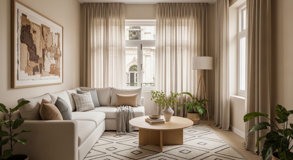
A living room that is beige is a lot calmer, than one that’s neon yellow.
Colour in interior design is not just decoration – it’s emotional architecture.
Interior design psychology looks at the psychological impact of colors and asks:
- Does this colour evoke calm?
- Does it energise?
- Does it overwhelm?
- Does it make the room feel smaller or larger?
The answers shape the final design.
Recommended: Looking For 2bhk Interior Design Cost in Kolkata [2026]?
Why Colour Is So Powerful in Home Interior
Before we notice furniture.
Before we admire lighting.
Before we comment on décor.
We feel the colour.
The use of colour is one of the strongest design elements in any home interior. It can:
- Create focus in a home office
- Encourage relaxation in bedrooms
- Stimulate appetite in dining spaces
- Influence conversation in living spaces
The impact of colors in interior environments is subtle but constant. We live inside these shades every day. They quietly shape our energy.
Modern interior design today doesn’t just follow design trends. It uses color psychology in interior design to create spaces that support real life – stress, work, family, rest. This is why many homeowners also consult an interior designer in Kolkata to select colour palettes that balance aesthetics with comfort.
The Colour Wheel (Made Simple)
Do not worry. This will not feel like an art class.
The color wheel is a tool that helps us with design. It helps us understand how different colors work together. The color wheel is really useful, for this. We use the color wheel to see how different colors are related to each other.
It starts with:
- Primary and secondary colors
- Warm vs cool tones
- Complementary colors (opposites on the wheel)
From here, we build colour schemes:
- Monochromatic colour schemes – variations of a single colour
- Analogous colour schemes – colors like blue and green placed next to each other
- Complementary colour combinations – like red and green
Using the colour wheel properly helps create a balanced color scheme rather than a chaotic one.
Because balance feels good. Chaos doesn’t.
Know more: Looking For 3BHK Interior Design Cost in Kolkata [2026]?
The Psychology Behind Different Colors
Let’s talk about how different colors actually make us feel – in real life.
Red & Orange – Energy and Emotion
Red is the color of intensity. It demands attention.
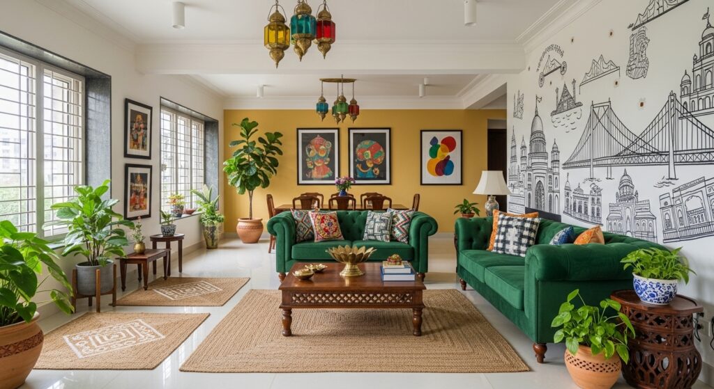
Red and orange are bold colors. They stimulate energy and conversation. That’s why you’ll often see them used in dining areas.
But here’s the honest part – too much red can feel overwhelming. It raises energy levels, which is great for social spaces but not ideal for relaxation.
In home interior design, red works best as an accent colour rather than the dominant color.
A cushion.
A painting.
A statement chair.
That’s enough.
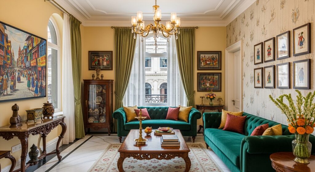
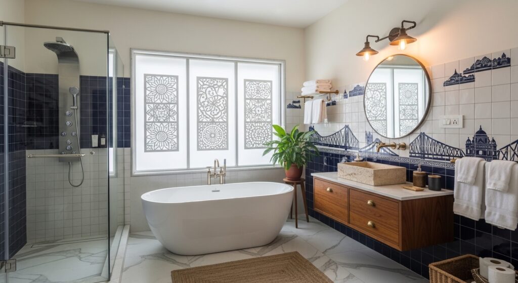
Blue – Calm, Focus & Stability
Blue is one of the most used in interior design colours for a reason.
Shades of blue naturally evoke calm. They lower stress and improve concentration. That’s why blue is perfect for bedrooms and home office setups.
Different shades of blue create different moods:
- Light blue = openness and airiness
- Navy and royal blue = depth and sophistication
- Blue and green combinations = emotional balance
If you have ever sat in a blue room and felt your shoulders relax you have experienced how colors can affect your mood in interior design firsthand.
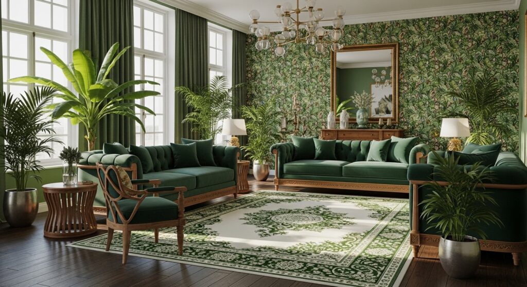
Green. Balance and Comfort
Green is right in the middle of the color wheel.. It feels balanced to us emotionally.
Green reminds us of nature. It helps reduce stress. It creates harmony in our living spaces, with the color green.
In interior design green colors that look like earth are popular. Not just because they look beautiful but because they make people feel calm and connected to the earth with green.
Blue and green together create spaces that feel calm and peaceful without feeling boring with the colors blue and green.
Yellow – Warmth & Optimism
Yellow brings warmth into a space.
Soft yellow makes an ideal wall colour in spaces that need brightness – especially kitchens. But vibrant color variations must be handled carefully.
Too much intense yellow can feel restless.
Like sunlight – a little feels uplifting. Too much feels harsh.
Balance it with neutral colors to create a balanced color atmosphere.
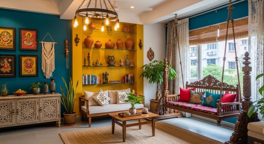
Neutral Colors – Stability & Flexibility
Neutral colors are the quiet heroes of interior colour planning.
Beige. Grey. White. Taupe.
Neutral colors do not shout for attention. Neutral colors create calm and flexibility. Neutral colors allow you to experiment with color tones and bold colors in your décor without overwhelming the room.
In homes neutral colors become the dominant color with accent color pieces adding personality to the space.
Neutral colors do not mean boring neutral colors can be really nice.
It means adaptable.
Colour Psychology for Different Rooms
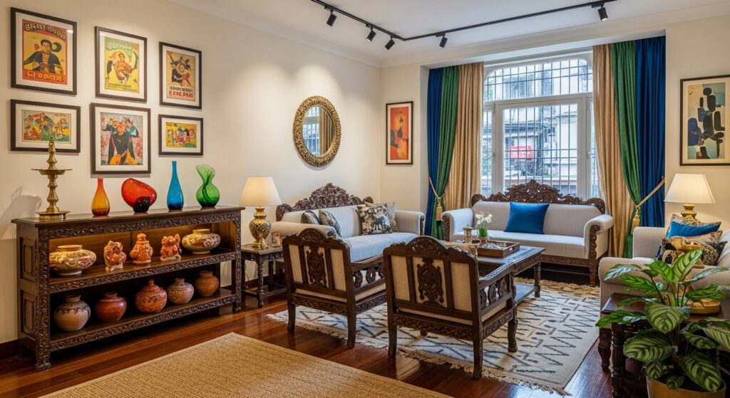
Living Spaces
Living spaces are emotional hubs.
Here, we laugh. Talk. Host. Relax.
The psychology to create welcoming living areas often includes:
- Warm neutrals
- Muted greens
- Soft blues
The goal is to create a balanced color scheme that encourages comfort and connection.
Home Office
A home office needs clarity and focus.
Blue improves concentration. Green reduces eye strain. Avoid strong red as the main wall colour – it may increase tension.
Colour choices here directly affect productivity. This is where interior design psychology truly matters.
Bedrooms
Bedrooms should feel safe and restful.
Shades of blue, sage green, or soft neutral tones make ideal wall colour choices.
Avoid overly bold colors like bright red as the dominant shade. While red is the color of passion, it may not support deep sleep.
Bedrooms are not showrooms.
They are recovery zones.
Read more: Modern Bedroom Storage Ideas for Kolkata Apartments (2026)
Common Colour Mistakes (We’ve All Made Them)
Let’s be honest – most of us have chosen colors purely because they looked good online.
But what works in one home may not work in another.
Avoid:
- Too many vibrant color tones in one room
- Ignoring natural lighting
- Choosing colors without testing samples
- Copying color schemes blindly
The impact of colors in interior spaces is personal.
Always test things out. Always pay attention to what’s happening. Always sit in the room before you make any decisions.
The Power of Color Psychology is really something
What is really important about color psychology is being aware of it.
When you know that colors can affect how you feel how you behave and how you get along with people in your home you can start designing your space in a smart way.
You can use colors to make your home a better place to live. Color psychology is, about using colors to make your life better.
You stop asking, “What’s trending?”
And start asking, “How do I want this space to feel?”
Colour psychology for interior design is about creating spaces that:
- Support calm mornings
- Improve focused afternoons
- Encourage warm conversations
- Provide peaceful nights
It’s not dramatic.
It’s subtle.
But it’s powerful.
Conclusion
Colour Psychology in Interior Design is not just theory from design books.
It’s the reason one room feels comforting and another feels cold.
It’s the reason some spaces energise you while others exhaust you.
The psychology of colors in interior design reminds us that colour can influence our daily life more than we realise.
By understanding the colour wheel, using color theory wisely, and making thoughtful color choices, you can create spaces that truly support your lifestyle. Many homeowners also seek guidance from a home interior designer in Kolkata to select colour combinations that match both the space and the mood they want to create.
Because at the end of the day, interior design isn’t just about aesthetics.
It’s about walking into your home…
Taking a deep breath…
And feeling exactly how you want to feel.