Wardrobe Colour – Choto Jinish, Boro Impact!
Let’s get one thing straight.
Your wardrobe isn’t just a box where you dump your clothes. I mean yes, that’s what most of us use it for – let’s not pretend otherwise. 😂 But here’s what people forget.
Your wardrobe is probably the SINGLE LARGEST piece of furniture sitting in your bedroom. In most Kolkata flats – especially 2BHKs and 3BHKs in areas like Garia, Behala, Rajarhat, New Town – the wardrobe literally takes up one full wall. Sometimes even more.
So imagine that one massive wall covered in a colour that looks… weird. Or doesn’t match anything else in the room. Or just feels heavy and dark in an already small bedroom.
Not a great feeling, right?
On the other hand, imagine a wardrobe colour that makes your bedroom feel bigger. Brighter. More “you.” That’s the power of choosing the right colour combination. It doesn’t cost extra. It doesn’t need extra space. It just needs a little thought.
And that’s exactly why we’re here today. After 8+ years of designing wardrobes across Kolkata – from compact flats in Tollygunge to spacious homes in Salt Lake – we are the best interior designer in Kolkata have seen what works, what doesn’t, and what makes people go “WHOA” when they see the final result. ✨
So let’s get into it. No boring colour theory. No confusing shade names. Just real, practical, beautiful wardrobe colour combinations that you can actually use.
Before We Start – 3 Things to Keep in Mind
Look, before we throw 23 colour combinations at you, let’s talk about a few things that actually help you pick the RIGHT one for your home.
1. Look At Your Bedroom Size
This is non-negotiable. If your bedroom is small – and let’s face it, most bedrooms in Kolkata flats aren’t exactly palaces – you need lighter shades. Dark colours make small rooms feel even smaller. That’s not an opinion, that’s just how it works.
If you have a big bedroom? Lucky you. Go bold. Go dark. Go crazy. You’ve got the space to pull it off.
Recommended: Modern Bedroom Storage Ideas for Kolkata Apartments (2026)
2. Check How Much Natural Light You Get
Got a bedroom with big windows and lots of sunlight? You can experiment with deeper tones like navy, charcoal, or walnut brown. They’ll look rich and warm.
But if your room is on the ground floor or facing another building (hello, most Kolkata apartments 🏢), stick to lighter or medium tones. Trust us on this.
3. Think About the Overall Bedroom Vibe
Is your bedroom modern and minimal? Go with clean, solid colours. Is it more traditional and cozy? Warm wood tones will feel right at home. Is it your kid’s room? Have some fun with colours!
Simple, right? Okay NOW let’s get to the good stuff. 🎉
23+ Modern Wardrobe Colour Combinations for Every Taste
1. White + Walnut Brown
This one is a CLASSIC. The kind of combination that never, ever goes out of style. Crisp white panels on top, warm walnut brown on the bottom – or the other way around. It looks clean, it looks expensive, and it goes with literally any bedroom theme. If you’re confused and can’t decide anything, start here. You won’t regret it.
Read More: Colour Psychology in Interior Design: Mood & Behaviour Guide
2. Frosty White + Charcoal Grey
Want something modern without being too bold? This is your combo. The white keeps things light and airy, and the charcoal grey adds that sophisticated edge. We’ve done this in so many Rajarhat and New Town apartments, and every single client has loved it. Every. Single. One.
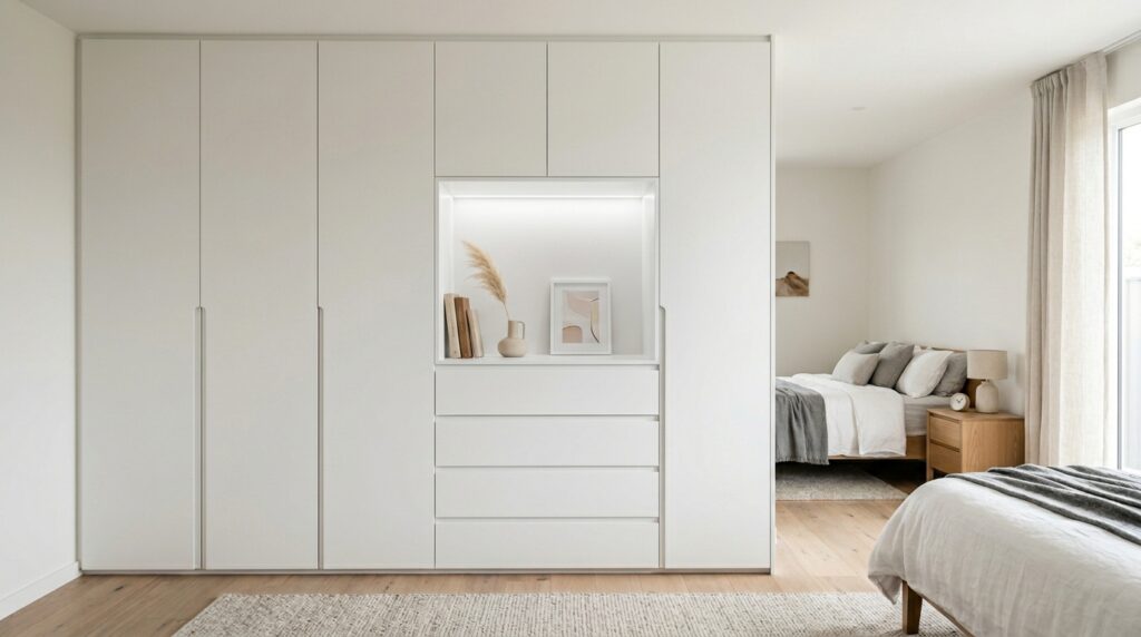
3. All White (Matte Finish)
“Puro shada? Boring hobe na?” – that’s what everyone says. Until they see it done right. An all-white matte wardrobe in a small bedroom? It literally makes the room look double the size. Pair it with brass or gold handles and tell us it doesn’t look stunning. Go ahead, we’ll wait. 😏
4. Champagne Gold + Cream
If you like things elegant and classy – the kind of wardrobe that whispers luxury instead of shouting it – this is your match. Champagne gold laminate with creamy off-white panels. It’s warm. It’s sophisticated. It looks like something out of a design magazine. Perfect for master bedrooms.
5. Dust Grey + White
A softer version of the charcoal-white combo. Dust grey is calm, peaceful, and easy on the eyes. Combined with white, it creates a bedroom that feels like a retreat. After a long day of battling Kolkata traffic and humidity, who doesn’t want a room that feels like a mini vacation? 🌊
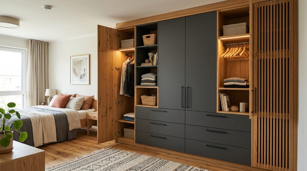
6. Wooden Oak + Black
Now we’re entering bold territory. This combo is for people who want their bedroom to make a statement. The warm oak texture brings natural richness, and the matte black panels add drama. It works BEAUTIFULLY in larger bedrooms with good lighting. Not for the faint-hearted, but absolutely gorgeous when done right.
7. Pastel Blue + White
Refreshing, calming, and perfect if your bedroom gets a lot of sunlight. Pastel blue and white together create this breezy, almost beach-house kind of vibe. It’s a favourite for kids’ rooms too, but honestly? It looks just as amazing in adult bedrooms. No rules here.
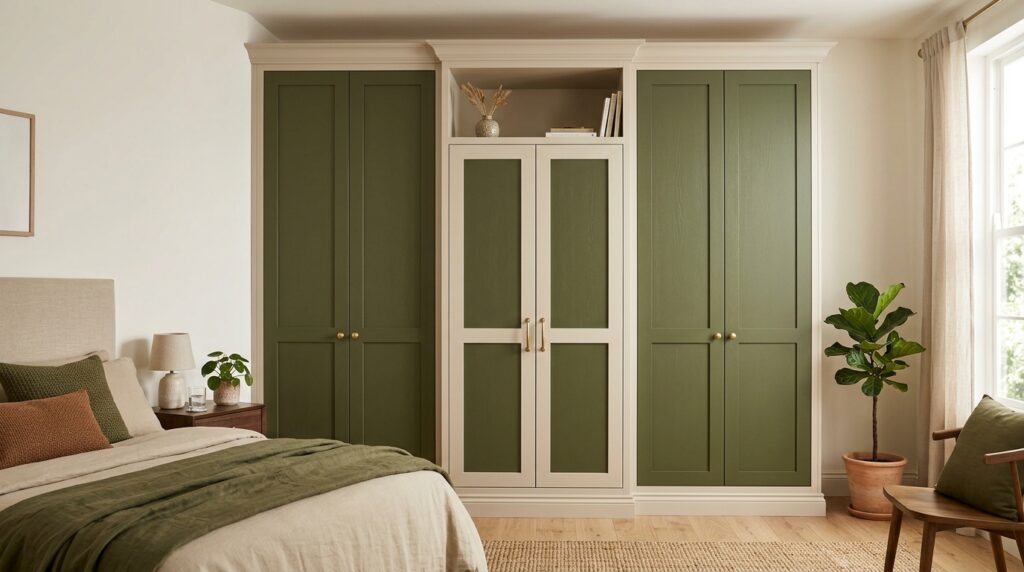
8. Olive Green + Beige
This one’s trending like crazy right now and honestly, we understand why. Olive green gives that earthy, grounded feeling – and when you pair it with soft beige, the whole wardrobe looks organic and modern at the same time. If you love nature-inspired interiors, you NEED to try this.
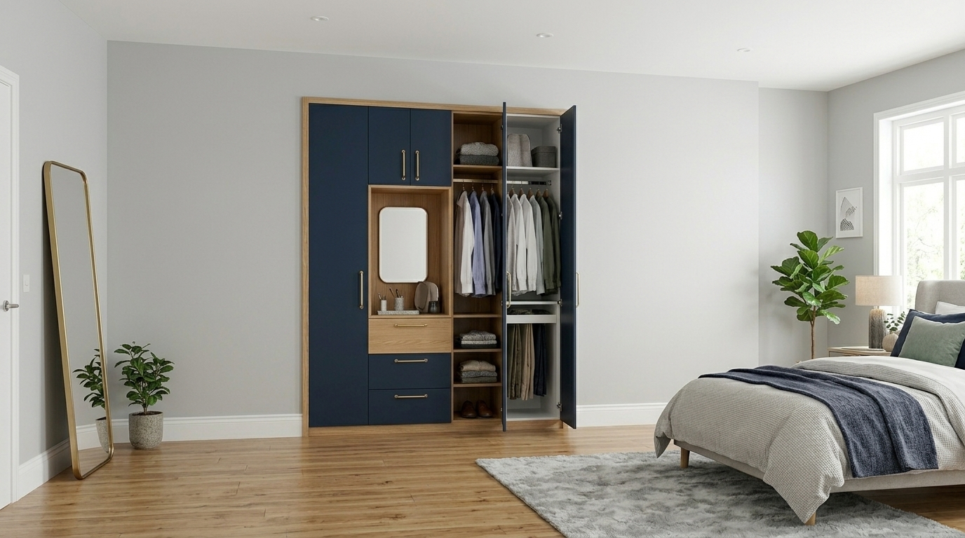
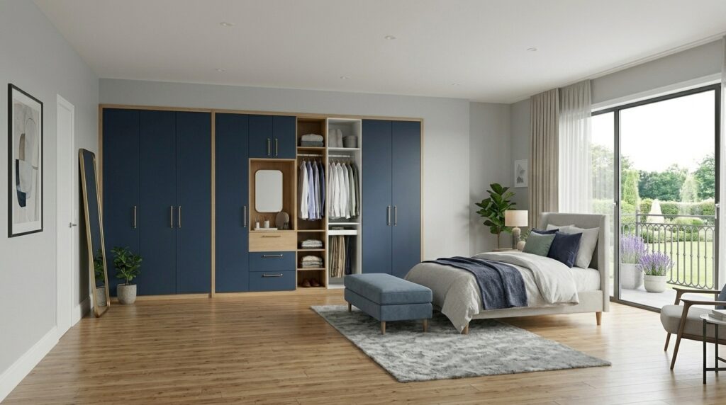
9. Navy Blue + Gold Accents
Royal. That’s the only word for this combo. Deep navy blue wardrobe panels with slim golden handles or golden edge strips? Your bedroom suddenly feels like a five-star hotel suite. Not even exaggerating. We did this recently in a home in South Kolkata and the client literally said, “Hotel e thakchi mone hochhe.” 😂👑
10. Walnut Brown + Beige
If you love that warm, woody look but don’t want the entire wardrobe to feel heavy, adding beige panels breaks it up beautifully. This combination feels grounded, cozy, and timeless. It’s one of those combos that looks good in 2024 and will still look good in 2034. No trend, no expiry date.
11. Concrete Grey + White
Urban. Industrial. Modern. If your bedroom has that contemporary loft-style vibe, concrete grey laminate combined with white panels is chef’s kiss. 🤌 It gives the wardrobe an almost architectural look – like it belongs in a design studio. Young couples in New Town and Rajarhat, this one’s calling your name.
12. Rose Pink + White
This isn’t your typical “girly pink.” We’re talking about muted, sophisticated rose pink combined with clean white. The result? A wardrobe that feels feminine, stylish, and modern – without being over the top. Perfect for a daughter’s bedroom, or honestly, for anyone who loves a touch of warmth and softness. 🌸
13. Teak Brown + Ivory
This is for those who love traditional vibes but want it to feel fresh. Teak brown has that deep, rich character – almost like old Kolkata furniture that your dadu had. But pair it with ivory instead of plain white, and suddenly it feels updated. Heritage meets modernity. Very Kolkata, if you think about it.
14. Sage Green + Cream
Sage green is everywhere right now – from cafes to living rooms to Instagram feeds. And for good reason. It’s calming without being boring. Combine it with cream panels and you’ve got a wardrobe that looks expensive, trendy, AND peaceful. Three things at once. That’s a win. ✅
15. Graphite + Warm Wood
Think dark graphite grey paired with panels that have a warm wood grain texture. This is moody, sophisticated, and absolutely perfect for someone who wants their bedroom to have that international designer look. It works especially well in bedrooms with neutral wall colours and good artificial lighting.
16. Burgundy + Cream
Feeling a little dramatic? Burgundy is bold, rich, and full of character. But you don’t want the whole wardrobe in burgundy – that’s too much. Mix it with cream and suddenly you have a statement piece that’s bold but balanced. This works brilliantly in larger master bedrooms with darker flooring.
17. Light Maple + Grey
Maple has this beautiful golden tone that feels warm and inviting. When you pair it with soft grey, the wardrobe feels modern but not cold. It’s like getting a hug from a really well-dressed person. 😄 Great for apartments that don’t get a ton of natural light – the maple brings its own warmth.
18. All Grey (Two-Toned)
Here’s a trick that designers love – use TWO different shades of grey on the same wardrobe. Say, light grey on the shutters and darker grey on the side panels. Or vice versa. It creates depth and dimension without introducing any new colour. Minimal, modern, and incredibly sleek.
19. Lavender + White
Soft, dreamy, and unique. Lavender is one of those colours that most people never think about for a wardrobe – which is exactly why it stands out. Paired with white, it creates a space that feels calm and slightly luxurious. Ideal for guest bedrooms or your personal reading nook. 💜
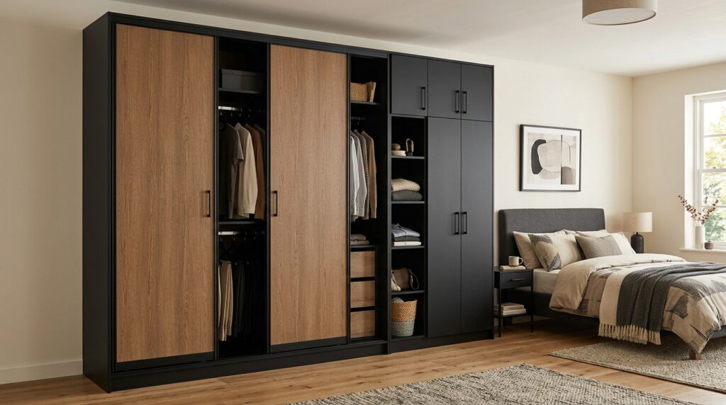
20. Tan Brown + Black
Earthy tan paired with sharp black edges. This combination has that leather-jacket-with-jeans energy. Casual but put together. Effortless but stylish. It works in bachelor pads, modern apartments, and even home offices where the wardrobe doubles as storage.
21. Peach + White
Peach is one of those colours that makes everything feel warm and welcoming. It’s not as strong as orange, not as subtle as cream – it sits right in the sweet spot. Pair it with white and your wardrobe becomes the coziest thing in the room. We’ve used this combo in many family apartments and the feedback is always – “Room ta khub hashi-khushi lagche!” 🍑
22. Aqua Blue + Light Wood
This one’s got vacation vibes written ALL over it. Aqua blue reminds you of the sea. Light wood reminds you of beach shacks. Together on a wardrobe? Your bedroom suddenly feels like Goa moved to Kolkata. 🏖️ Works best in well-lit rooms with white or off-white walls.
23. Black + White (Half-and-Half)
You knew this was coming. The OG. The timeless. The black and white wardrobe. Half the shutters in matte black, half in matte white. Clean lines, no drama, no fuss. It works EVERYWHERE. Small room, big room, modern flat, traditional home. You literally cannot go wrong with this. Period.
BONUS Combos Because We Can’t Stop! 🎁
24. Terracotta + Off-White
Terracotta is having a MOMENT right now. That earthy, clay-like tone paired with off-white? It screams modern Indian design. Very rooted. Very elegant.
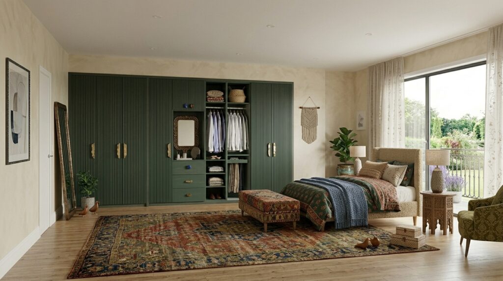
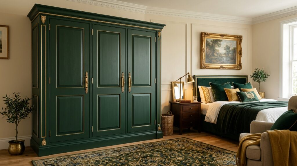
25. Forest Green + Gold
Luxury, luxury, luxury. This combination is for people who want their wardrobe to be the STAR of the bedroom. Deep forest green with gold handles or strips. Take a bow. 🌿👑
“Okay But How Do I Actually Choose?”
We get it. 23+ options can feel overwhelming. So here’s a very simple cheat sheet:
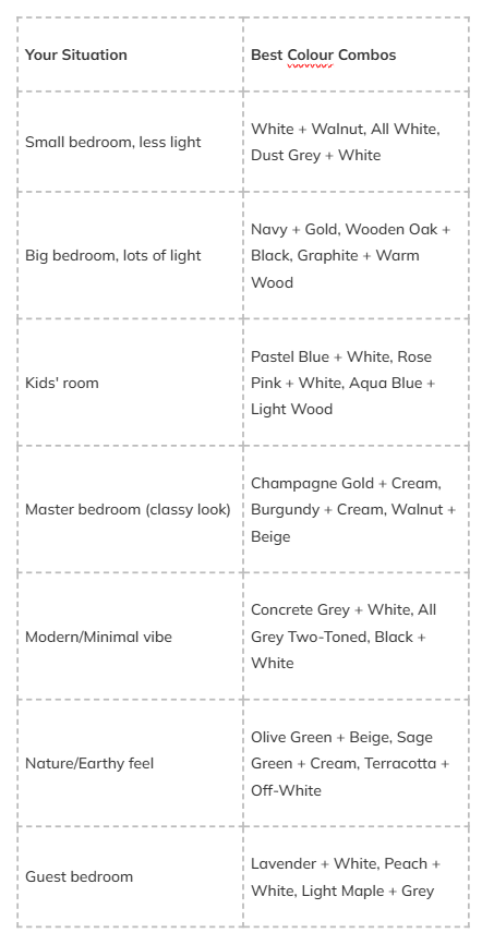
See? Not so confusing after all. 😊
Still Confused? Let Us Help!
Look, reading about colours online is one thing. But actually seeing how they’ll look in YOUR bedroom, with YOUR wall colour, YOUR flooring, YOUR lighting – that’s a completely different game.
And that’s exactly what we do at RK Interior Designer.
For over 8 years, we’ve been designing wardrobes across Kolkata – from compact 1BHKs in Behala to spacious homes in Salt Lake and everything in between. We don’t just pick colours randomly. We look at your room, understand your style, check your lighting, and THEN suggest combinations that actually work.
No guesswork. No “let’s hope this looks good.” Just proper planning and beautiful results.
Because at the end of the day, your wardrobe isn’t just furniture. It’s the first thing you see when you wake up and the last thing you see before you sleep. Shouldn’t it look absolutely perfect? ✨